
 Landlord Products / Services
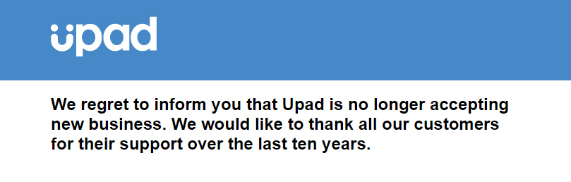
Well, fuck me sideways and stick a fork in me. I’m shocked, but I’m kinda’ really not!
On the 11th October 2019, Upad.co.uk, one of UK’s most popular and longest serving online letting agents, officially waved the white flag and pulled the plug on accepting “new business”
I presume that means she’s with her maker now.
R.I.P, ma’ lady.
Current Upad Customers
First and foremost, if you’re currently using Upad’s service, you should read the FAQ they have released (link to FAQ has been removed).
Secondly, both 99home and LettingAProperty.com have reached out to me after hearing the news. They want me to let you know that they’re both offering all Upad clients FREE Rightmove/Zoopla listings. Mighty generous! Please, go bite their hands off.
Thirdly, if you have a tenant referencing file open with Upad, you can contact LandlordforLegal.co.uk directly, they will be happy to assist.
Finally, if you’re looking for a Upad replacement service, here is a list of them.
Please drop a comment below if you have any questions or find yourself in a terrifying bind! I’ll try my best to assist where I can, and I’m sure others will, too.
So, what happened?
Now, onto the mess…
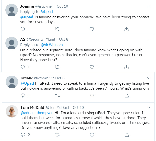
Earlier this week on Twitter, I started detecting signs of encroaching disaster; it was obvious shit had hit the fan and something ugly was unveiling at Upad HQ:
I’ve always been a massive fan of Upad – despite their gut-wrenching, noncompetitive prices – because of their solid customer service. It’s the one reason I felt entirely comfortable recommending their services to you. Yup, I knew you’d have to cough up more cheese if you used them over their rivals, but I also knew you would be in safe hands. They were an ideal solution for any landlord trying out an online letting service for the first time.
So as soon as I heard that Upad’s customers were being shunned like lepers, I strongly suspected that it was game over. I knew it, I was just waiting for the official confirmation before I proceeded gossiping like a little girl.
Now that it’s been made official, simply, a mixed bag of emotions from my end:
- Surprised
- Not surprised
- Disappointed
- Bitter
Surprised
I didn’t see it happening this week. I really didn’t.
I was certainly taken aback by the news.
That said, I’m not entirely surprised it happened. But I’ll get to that shortly.
Disappointed
I’m disappointed for a few different reasons in a few different ways:
- I’m disappointed it happened.
I’ve always had a positive relationship with Upad in terms of their service and the people behind the company. They constantly provided me with exclusive discount codes and promos so I could share them with you, and I will forever be grateful for that.
I’ve successfully used Upad on several occasions and I’ve always felt I received value. I didn’t get any special treatment; they didn’t even know I was using their service most of the time. I was just a regular customer, minding my own business.
Everyone I ever dealt with has been nice (from what I remember, anyways). I’ve personally engaged with the CEO, James Davies, on many occasions over the years, and he’s always been a top geezer. He’s always been optimistic and lively.
Me and James regularly used to meet at his favourite Pizza gaff on Oxford Circus, where I’ve watched him throw an ungodly amount of melted mozzarella down his gullet for pleasure. I think there was a pizza-base and a couple of tomatoes under the gooey mesh somewhere, but I never actually saw it with my own eyes. Good guy, loves cheese! I hope we continue to stay in touch and indulge. Other than a couple of very short text message exchanges Thursday afternoon, I haven’t spoken to him, but I plan to shortly.
I feel for James and the entire team; I’m sure this has been a devastating blow. For James in particular, of course, because I know Upad was his baby. I’m sure he’s suffering. My deepest condolences goes out to him.
Above all, I’m disappointed because we have lost a genuinely great service.
- I’m disappointed by how it happened.
I don’t understand the process of closing down a company – hopefully I never will – but I appreciate there is a legal and practical path to take in these circumstances. I imagine there was a last minute scramble to pump life back into the old girl, sparing her from the brink of death, which is why complete silence may have been the advised route to take.
However, from a purely human and moral standpoint, I didn’t like what I saw: landlords left in the lurch, not knowing what was happening, and not knowing where to turn. I’m sure I only saw a small fraction of the panic. Upad seem to have come to a jarring standstill on Monday, and since then none of their customers have been able to receive support.
I didn’t like that at all.
People will lose money, not just because they paid for a service they won’t receive, but in other, perhaps more critical and concerning ways. For example, I was contacted on Twitter by someone that had paid for Upad’s ‘tenant-find’ and ‘compliance’ service, which ensures all the legal paperwork is in place. He had successfully found a tenant, but the paperwork had not been complete, and he wasn’t sure what he needed to do in order to comply with the law, particularly in regards to the tenancy deposit’s prescribed information.
Fortunately I was able to put my superhero pants on and point him in the right direction, but what about everyone else who paid Upad for their compliance service? Will many just end up failing to meet their obligations? Perhaps.
As said, I don’t know if it had to end the way it did from a legal or practical standpoint, but I don’t think it would have been impossible to turn the lights off with a little more class.
The silent treatment was not cool. I ‘spose I expected more from a company that excelled in customer service, even in their darkest hours, right until their last breath.
I also managed to catch a string of disgruntled Tweets from an ex Upad staff member that was in the thick of the crisis; he didn’t seem too pleased with how it all went down either. I don’t want to comment too much on internal matters, but I believe the staff were just as surprised and
fucked offcaught off-guard as much as their customers’ were by the events that took place this week.From the little I could puzzle together, it seems like one day Upad was open, the next day the staff and customers were being shooed away like a rancid cluster of farts.
Bitter
- I now have to untangle and remove all traces of Upad recommendations from my website. That shit is going to take forever and a day; their brand and promos are literally scattered all over the place like maggots, including the very edges, and darkest of crevices. I’m mortified by the position I’ve found myself in.
- I love you guys, you know I do. I adore shooting the shit with you. You guys are fun.
But I only published a new blog post last week, so I wasn’t expecting to get high-off-my-tits on caffeine in order to smash together another until next month. Hell, I may have even stretched my leave until early 2020. Either way, I certainly wasn’t expecting to engage twice in the space of one week.
I’m seriously struggling to decide who is the biggest victim in all this.
Fuck it, I’ll say it, it’s me!
Coffee donations welcome.
- Up until earlier this week, I have been recommending Upad’s services through previously written blog posts, automated emails and promo banners (which have all either been demolished or updated, I hope), so there’s a good chance I’m responsible for pointing people towards a dead end.
I started removing all the Upad promotional material as soon as I suspected there was trouble in paradise; I didn’t even wait for the coroner’s report. The fact Upad were giving their customers the silent treatment was enough of a sign for me to act quickly.
Some of you may have noticed that I’ve also been faffing around on my social media accounts, reaching out to Upad customers, offering my support, and helping where I can, whether I originally refereed them to Upad or not. I wasn’t discriminating or doing it for personal gain, I was just desperate to wash away my sins and re-balance my Karma.
I can only apologise, truly. I feel terrible if I lead anyone down the wrong shitty path.
Like I said, if anyone is in a bind due to the fall of Upad, please reach out.
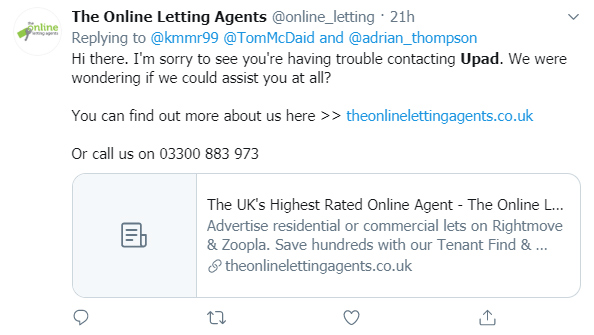
Evidently, I wasn’t the only one quick to pull the trigger; the circling vultures took immediate advantage, hoping to profit from Upad’s predicament.
I noticed theonlinelettingagents.co.uk frantically doing the rounds via their Twitter account, attempting to patch together the wounded soldiers. Amusing, and fair play.

Not surprised!
I wasn’t surprised to hear the news. I really wasn’t.
While the why has yet to be confirmed, I can only imagine it had something to do with concerning financial woes. It usually always is in these cases. No one shuts shop in this way because they’re making more money than sense.
According to this article on propertyindustryeye.com, “Upad’s last accounts, for the year to end of March 2018, show that the business was over £1.4m in the red.”
Bear in mind, I don’t know the facts, but I will share a few of my thoughts based on my observations working with Upad and the industry in general over the years, which I believe relates to why we’re gathered here today, under these horrific circumstances…
- Investment: I don’t know how many investment rounds Upad did over the years, or how much they managed to raise, but it seems like they were surviving off raised capital from investors, and not revenue from sales.
You can only do that for so long before investors start asking questions and cutting off the supply.
If that was the case, their burn rate may have sucked resources dry and eventually choked them unconscious.
What happens to those investors and their money now? I don’t really know to be honest. I suspect the same as when any gambler continues to back losing horses…
- Staff: I visited the Upad offices a few times, and every time I walked away thinking to myself: ‘why’ and ‘how’ the fuck is there so many members of staff? The numbers seemed excessive!
The overload of bodies explained how they were able to provide excellent customer support – that department in particular was stacked – but I couldn’t fathom how they were able to pay so many salaries. It seemed mental.
They also had a stacked IT department, which you may think would make sense for a tech company, but it also seemed excessive. Software engineers and developers are not cheap at all.
If money was the issue, or one of the primary contributing factors, it wouldn’t surprise me at all.
I don’t consider Jay-Z to be a particularly profound individual, and he certainly doesn’t inspire me, but I remember watching an interview of his several years ago, and he said something that has always stuck with me. He was asked why he was so successful as a businessman. I don’t remember his exact response, so to paraphrase:
I streamline my businesses.
You see a lot of other music labels signing hundreds of artists but most of them never materialise. I don’t sign hundreds of recording artists to my label because there aren’t hundreds of good one’s out there. I only sign a couple of the best, because that’s all there is.
I keep it streamline.
I’m with you, Jigga man.
For most small to medium sized businesses, I can’t help but believe streamlining is critical, even while trying to expand and take over the world. I hope that’s evident by the topics I cover on here – I always try to encourage you to streamline your landlord business, avoiding frivolous spending. Actually, that’s been the purpose and primary objective of this blog for as long as I can remember now.
Case in point, my most recent blog posts include, saving money on energy bills by using auto-switch services and how to reference tenants cost-effectively. The list goes on.
Just from visual observations, the maths didn’t seem to make sense whenever I walked into Upad’s HQ. Money seemed to be being spunked all over the place. I guess that’s easy enough when the money isn’t yours.
- Competition: one beautiful word:
They are killing it! And literally, by the looks of it.
I suspect their continuing dominance of the market had something to do with the fall of Upad, and I wouldn’t be surprised if more heads roll for the same reason.
- Pricing: this is where I believe Upad got it all wrong; I think they tried to take advantage of a market they completely misunderstood.
I remember when Upad were priced at a reasonable £40 (maybe even less at one point) several years ago. Over the years I have watched them aggressively raise prices (way above inflation rates) while adding ZERO new features. If anything, they started unbolting features while asking for more money. I remember thinking, “this is suicide”, although I did appreciate that they were investing heavily in their customer support infrastructure.
By the time they closed their doors, their cheapest – and quite honestly, very bare – ‘tenant find’ product was a staggering £149 a pop, while everyone else was selling the same package for approx £50. Even if their customer service is worth that £99 extra, it’s insanely hard to win over new customers with an intangible commodity like ‘customer service’
When you stick “We provide the best customer service” on the tin, it really doesn’t mean anything, especially when you’re trying to sell a product that’s based on the premise of being a cheap alternative [to high-street agents].
By and large, landlords that use online letting agents are self-managing and price sensitive; they’re self-sufficient and looking for an effective way of getting their rental property listed on Rightmove & Zoopla for as little as possible. That’s it! Those types of landlords really don’t need the amount of support Upad invested in, in my opinion.
So I believe they either didn’t understand the market, or they tried to create a market.
By the end of it, I suspect Upad survived for as long as they did because of the loyalists they recruited in the early days and the few that trickled in after, but the numbers suggest they eventually found it extremely difficult to attract new customers and hold onto them, because they had priced themselves out of the market.
I think one landlord said it best on my Facebook group:
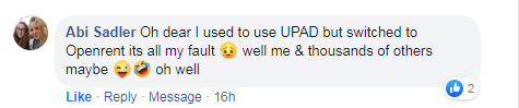

I’m actually surprised this bat-shit madness went on for so long.
Of course, the problem is, once you increase your prices to new heights, it’s terribly difficult to lower them again without damaging your product/brand, and possibly ego.
If I was in that position, I personally would have taken a hammer to my ego: I would have listened to what the market was telling me; I would have scaled back, lowered my prices and focused on volume and upselling other products. Instead, it seems as though they kept squeezing more and more out of their faithful returning customers. It was difficult to watch, really.
They didn’t have a USP, just a comparatively expensive product.
Simply, when landlords were confronted with Upad’s bog standard Rightmove/Zoopla package for £149, next to the likes of OpenRent’s 5 day free trial (followed by a £39 fee for new customers and £49 for existing customers), there was only ever going to be one man left standing.
- Weird packages & terrible website: aesthetically, the latest version of their website was beautiful. It looked the part, for sure. However, from a UX perspective, it made me want to rip the hairs off my tits with a sledgehammer.
I didn’t like how their website functioned at all, especially when they repackaged their products to the ‘uChoose’ product line; I found it so frustratingly confusing on many levels; it was difficult to know what they were actually trying to make us buy, mainly due to dire UX [that made me want to puke my guts out]. I won’t get into specifics, but take my word for it, if you will.
The ‘uChoose’ product line was meant to “simplify” the process, but I think it did the complete opposite.
I remember unloading my despair on Upad’s marketing guy one time, and his response was, “the UX is IT’s department.” I guess that was his way of telling me put my dick in my gob. So I shut my piehole.
I actually almost wrote an entire blog post about Upad’s terrifying UX (I was probably struggling for content ideas that month), detailing my every last gripe, because it tormented me that much. But then I realised no one really gives a shit. Then I wondered why I gave a shit. Then I stopped.
Did this actually have anything to do with Upad’s current demise, or am I just moaning for the sake of it? Probably a bit of both. But I genuinely believe their website and the way they lined up their packages did them no favours at all.
The purpose of sharing my thoughts isn’t to kick Upad in the nuts while they’re decomposing 6th feet under. I have too much respect and gratitude for Upad to do that. But I do want to be completely honest and open about my thoughts (which may or may not be related to what’s happened).
The whole debacle is interesting to me. I come from a tech background and worked in a very similar company to Upad in many ways (different industry, though). Only, they survived and recently got purchased for a shitload of cheddar by a huge company. Just saying.
Whatever happened didn’t happen over night. I don’t know how or why such an awesome company allowed themselves to get in such a mess, but it’s a dead shame.
Will Upad be back?
Upad’s brand will take a battering after this, but it will retain value [which will decline by the day]. So the question is, how much is it worth today?
My hunch is, behind the scenes, there are negotiations going on, or at least there is hope of negotiations, which will result in a resurrection in some form or another.
I say that because I found their closing statement… oddly optimistic! They didn’t actually say they were permanently dead in the water, instead they chose to head-fuck us with, “no longer accepting new business” What the hell does that even mean? Are they dead, are they on life-support, are they still accepting mouldy and stale business?
Am I reading too much into the cryptic phrasing, or do they hope to rise from the ashes?
To be continued…
For now, farewell Upad, and thank you for your spectacular service!
We, as landlords, have much to thank Upad for. Not only for the excellent service they have provided many of us with over the years, but also because they were the one’s that dragged the online lettings model to the forefront.
They were the first online agent to really push forward with the movement, which allowed others to gain recognition. Make no mistake, Upad did a lot of the heavy lifting for this industry. If it wasn’t for them, many of us would still be shelling out disgusting amounts of money on high-street alternatives. Moreover, many high-street agents were forced to lower their fees to complete.
Upad, thank you for your service, and I’m sad it ended the way it did. I hope lessons were learned, but above all, best of luck with your future endeavours.
On final note: since their departure, a few folk have questioned the sustainability of the online agency model (to be fair, high-street agents have always questioned it, for obvious reasons).
My answer to that is: here is a list of the best online letting agents and online estate agents on the market, post Upad.
Landlord out xo
P.s. Terrible timing, I’m attending a Wedding on Sunday, so I’ll respond to comments when I return on Monday! Or Tuesday.
Disclaimer: I'm just a landlord blogger; I'm 100% not qualified to give legal or financial advice. I'm a doofus. Any information I share is my unqualified opinion, and should never be construed as professional legal or financial advice. You should definitely get advice from a qualified professional for any legal or financial matters. For more information, please read my full disclaimer.


 Guides")


This one sentence -
"I’m with you, Jigga man."
Mouthful of cornflakes and PMSL!!